In this post of making about bar graph – pie graph – picture graph working model – maths tlm working model – diy

Creating a bar graph, pie graph, and picture graph model using cardboard and colored paper is an engaging and educational project to visualize data representation.
Here’s a step-by-step guide to making a simple data representation model:
Materials you’ll need:
- Cardboard or thick cardstock (for the base and graph components)
- Colored paper (different colors for graph bars or slices, and pictures)
- Scissors
- Glue or adhesive tape
- Markers or colored pens (optional, for additional details)
Step-by-step process:
- Prepare the base:
- Cut out a rectangular or square piece of cardboard or thick cardstock to serve as the base for your data representation model. The size can vary depending on how detailed you want the model to be.
- Identify the data sets:
- Choose three different data sets that you want to represent using the bar graph, pie graph, and picture graph. For example, you could use data related to favorite fruits, favorite colors, or any other categorical data.
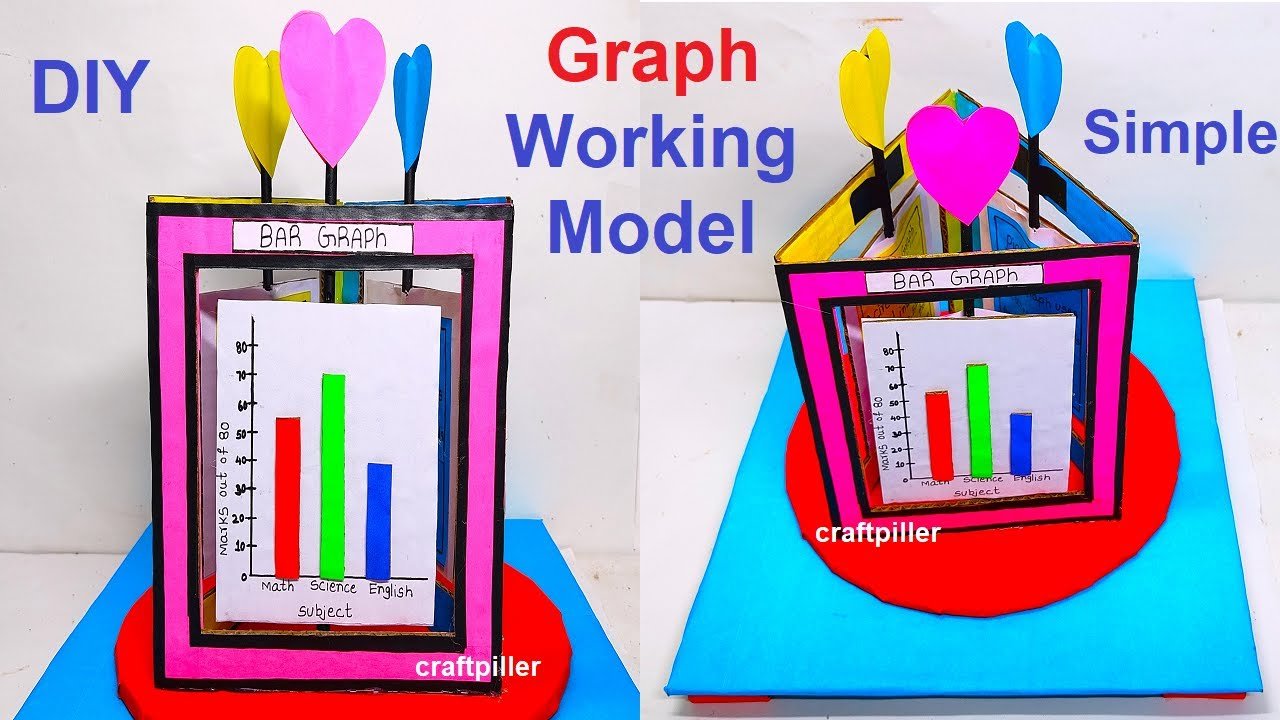
- Create the components:a. Bar Graph:
- Use colored paper to cut out rectangles of varying lengths, each representing the value of the corresponding data set. Label each rectangle with the appropriate category name.
- Cut out a circle from colored paper to represent the pie chart. Divide the circle into sectors, each representing the proportionate value of the corresponding data set. Label each sector with the appropriate category name.
- Use colored paper to cut out small pictures or icons that represent each category of data. For example, if you are using favorite fruits data, cut out pictures of apples, bananas, oranges, etc.
- Arrange the components:
- Glue or tape the graph components onto the cardboard base in their respective positions. Place the bar graph, pie graph, and picture graph next to each other to form a comprehensive data representation model.
- Use markers or colored pens to add additional details and labels to the data representation model. You can label the axes of the bar graph, add percentages to the pie graph sectors, and provide a legend for the picture graph.
- This simple model effectively demonstrates the basic concepts of bar graphs, pie graphs, and picture graphs and helps learners understand how to represent data visually.
#bargraph #piegraph #graph #maths #tlm #workingmodel #mathstlm #craftpilller